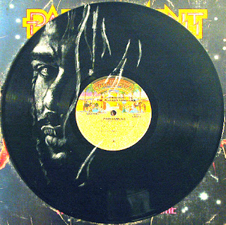
 The final presentation of artwork is vital to its marketability. People want to receive something they will be happy to hang on their wall as is with no complications. It needs to be professional and showcase the piece effectively. It's also an issue a lot of people bring up, everybody has an opinion. I try to take them all in and see how I feel about it. I am constantly re-evaluating my framing options.
I want to keep the pieces "affordable and portable", a quote from the owner of Wild About Music. I want them to be dramatic and simple, focussing attention on my painting. I'm going to get a frame from Gary of http://www.rockartpictureshow.com/ to try out. When I initially was looking into options, his patented frame caught my attention. I couldn't afford it then, but since Robert over at http://www.collectingvinylrecords.com/ connected us, maybe it'll work out. The frames are endorsed by The Smithsonian and Rock'N'Roll Hall of Fame! Pretty cool. They even have space at the bottom if I wanted to make a little plaque.
I'm also still deciding about doing ones without frames, using clear-coat to protect the painting. They'd be much easier to ship, but not as professional looking. It does make for a dramatic presentation though. I did get great response at Vinyl Killers.
Another idea is framing the record alongside the album sleeve so both are fully visible, like they frame gold records with the original album sleeve next to it. This is a cool idea, especially when the album I've used has an iconic sleeve, like "Dark Side". This is the opposite of no frame though: more expensive, harder to ship, and less portable. So we'll see! I'm open to any ideas you might have. If you want to see a bunch of examples how the pieces look the way I frame them currently,
CHECK OUT MY SITE AT: http://www.vinylart.info/
and let me know what you think about the issue of presentation in art.
 Subscribe in a reader
 Subscribe by email


No comments:
Post a Comment